Okay, here we go – the final section of the review on G2 Bruticus. I’ll start with Onslaught, the Bruticus himself, then show some of the box art work.
Let’s jump in with everybody’s favorite sour puss – Onslaught!
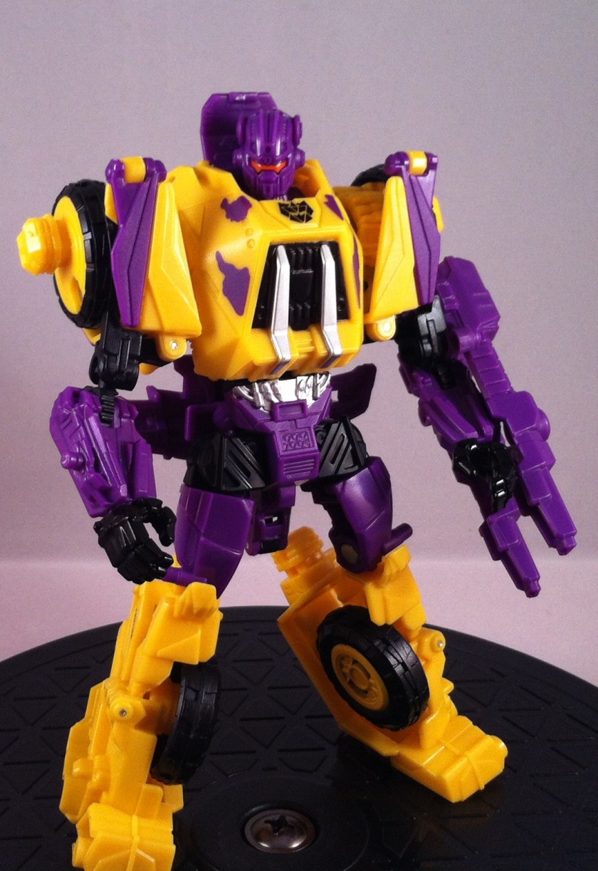
I really do love this mold. I know there are some gripes out there about his design, but honestly, I just love this guy. His head sculpt is awesome, I love how his calves have the connection pegs sticking out like a piston, I love that his tires are his shoulders, he’s just awesome…except that gun of his..but meh.
What I was not expecting with G2 Onslaught was his purple head. In all the preview pictures, he was shown with a black head, so I was pretty surprised to see a purple noggin sitting there. But really….I like it. Mainly because (once again) they gave him an Orange visor! I mean, if it were yellow, it might still look good, but Orange and purple is just so…evil! I I love the placement of the ‘Con symbol too.

As with the others, I keep his “rifle” pegged on his arm. It works as a shield too I suppose. Apparently there IS some kind of way to attach the gun to his back, but as of this post, I have yet to figure it out. I have a feeling it involves…cutting…which I am NOT doing to G2. Maybe retail.
Speaking of the other Onslaughts:
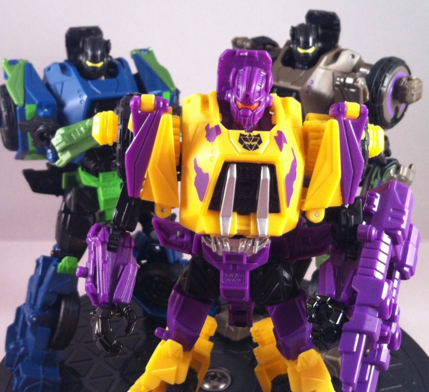
As with the rest of the G2 set, the detailing falls right in the middle of the three available versions. He has some great high lights and silver trim, but not as much detail as SDCC version. I wouldn’t mind some silver on his gun for sure. (*sigh*…PLEASE 3rd PARTY GUYS, Make an upgrade set for them!)
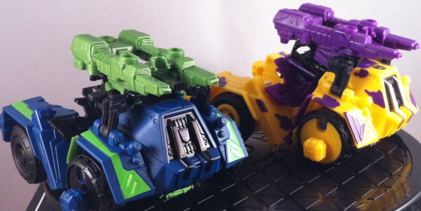
Alt-mode is nothing new, but again, the obnoxious yellow seems to work for me. I laugh at the purple camouflage. He’ll blend right into the jungle!!

Again, the lack of detailing is obvious when seen with SDCC:
Hmm…actually, that picture’s a bit bright. sorry about that. Here’s a look with Retail version:
Honestly, I think G2 is my favorite. I’m not sure what it is. I never had the Original G2 Onslaught, but I remember seeing him in the stores and wanting to buy him. (I ended up with a mix-match of G1 & G2 Combaticons and Arielbots, lol).
So let’s move on to the big guy himself – Big Bad Battlin’ Bruticus!:
Hah, kidding, kidding. Ahh, G1(2) combiners…great memories. Okay, here’s the big guy:
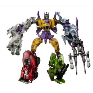
AGH! Hasbro…geeze…that looks…um….interesting. Okay, 3rd times a charm…here’s the REAL G2 FOC Bruticus:

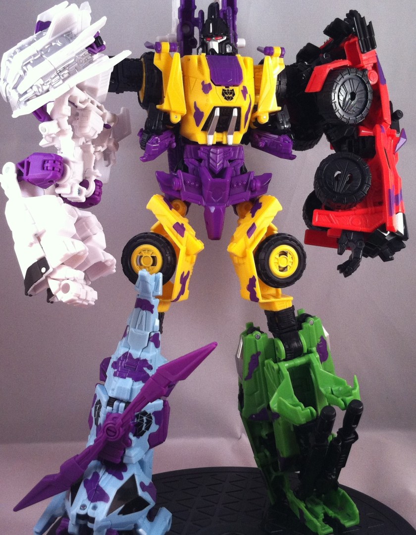
Ahhhh, better. MUCH Better. See, since SDCC Bruticus, I’ve been toying around with him, trying to find the best combination of “fan-made” transformations. At this point, I think I’ve found my “final form” – to an extent. Technically, I tend to keep Swindle as a leg, but for G2, I wanted to switch it up a bit. I have to say, I LOVE this form. I think he looks 100 times better than the Hasbro “official” form and retains a much more proportioned appearance.
Let’s take a closer look at this form, then I’ll get to the comparison shots.
From the front, the main goal has always been to keep all the limbs the same length. His goofy “gorilla arms” Hasbro wanted to go with just looked wrong. Swivling the thighs in this direction also help keep his legs more uniform, so they’re not super skinny, then fat. He can still pose, we’ll get to that, but for standing straight , I like this best. Vortex also makes an awesome leg, and Swindle makes a great arm if anything just for his awesome Hand mold. I wish the would have given that hand to Vortex.

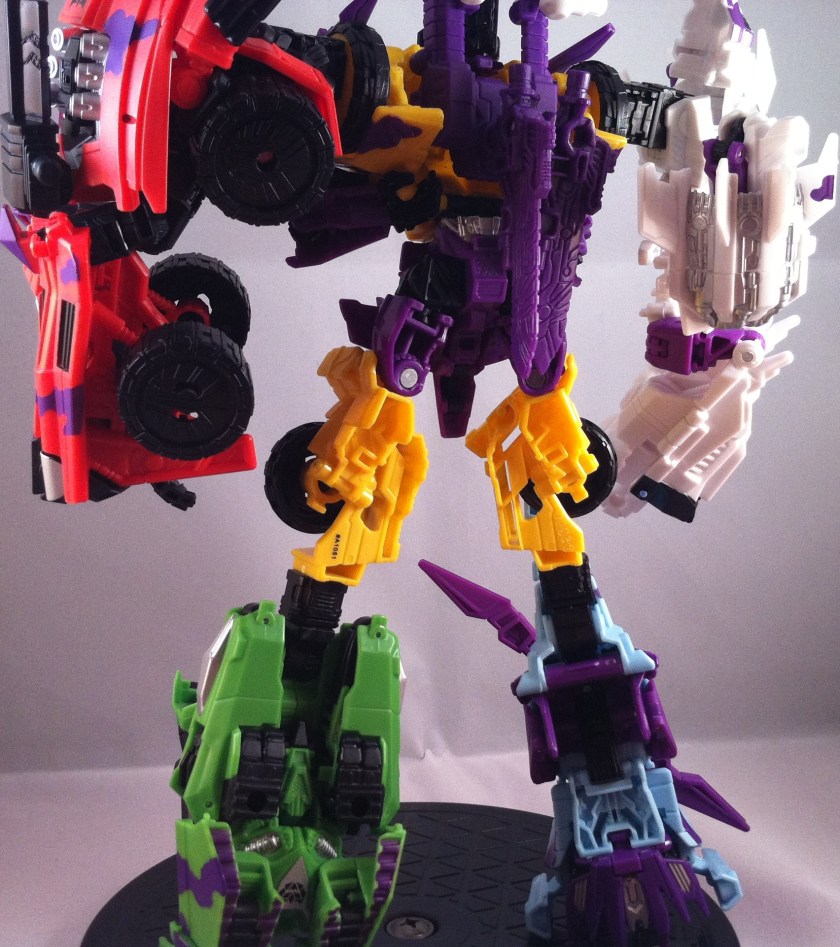
From the side….well..look, there’s just now way to get Bruticus here to look bulky like he does in the game. That’s what I call “Transformer Physics” where every member basically gains a little girth and bulks out. You can’t do that with a toy. So, the best we can get is a much more “robot” looking gestalt, instead of the wonky gangle monster he usually looks like.
As for Blast Off, well, the problem is, he makes a terrible arm for a guy that is SUPPOSED to be an arm. But he makes an even worse leg. So, the only real solution to his shuttle sides is to keep them up like this. It works in a way because Bruticus has more articulation with Blast Off as you can swivel the shuttle sides around and out of the way. I’ll keep fiddling with him to see if there’s a better fix. You can also do the Flamethrower mode seen here, which works too:
From the back, again, there’s no way to add any “bulk” all you can really do is try to fill it out. I honestly think his “gun” is laughable, so I tend to split up the weapons, and Blast Off’s guns (which I realize you can’t actually see here) help the whole “cannon” look on the back. There’s nothing you can do with Vortex’s swords so I just hid them in the gun peg in back, out of sight.
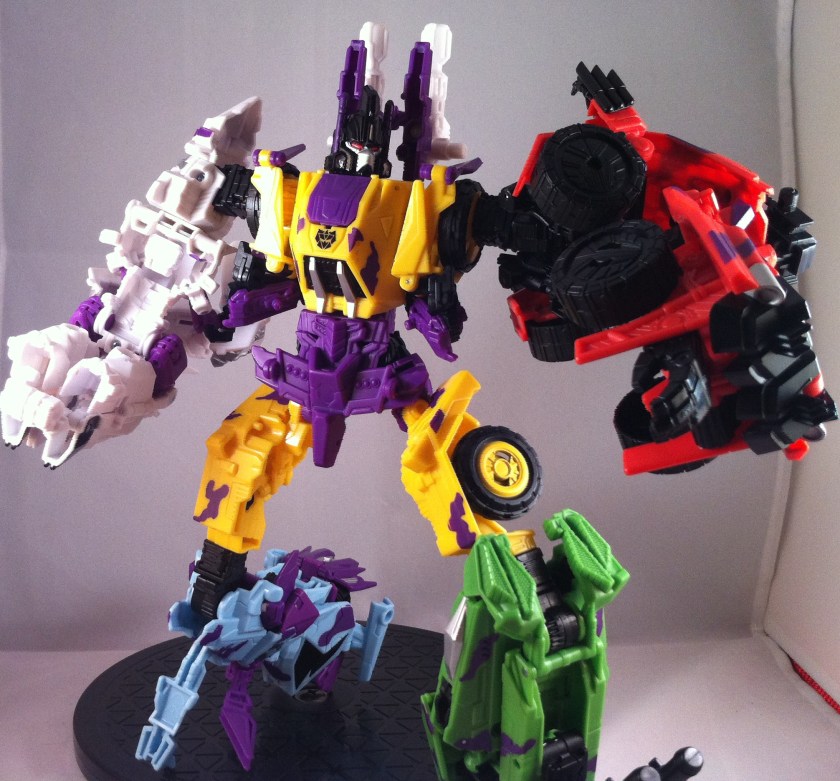
He still retains posability, though let’s face it, most gestalts aren’t the most flexible guys. Even my Devastator(Hercules) really isn’t doing any Yoga poses.
I absolutely love his head sculpt and the detailing done for the G2 version, however, I do have one little complaint here – I wish the would have done the “antenna’s” in anything BUT purple, seems the blend in with the cannons too much. Silver would have been nice, or plain black too. But its a minor issue. I love the fact that its SPOT on with the original G2 Head (see above).
So, let’s see how he stacks up with the others. Retail version is incomplete (sigh..I hate you, Target/Hasbro distribution plan…) But we can take a look at part of him:

I just noticed now that they both have red right arms, lol. Let’s look at SDCC – here you’ll see how this form looks with Swindle as a leg with Brawl:
I like both versions a lot – I do like SDCC’s set up because Vortex is available for the “shield” as seen in the game. I just hate that Kung-fu hand.
Unfortunately, they’re both WAY to big for my light box, so sorry about all the shadows.
EDIT: After reviewing the post, it just dawned on me that on G2 Bruticus, Brawl’s back section should be up like on SDCC. Technically it’s “correct” as seen here, but raising the back up to hid the knee joint looks way better (case in point, SDCC).
Also, in sad, sad, OH GOD NO! news, as I was disassembling SDCC Bruticus, the inevitable finally happened – Onslaught’s leg finally broke completely off:
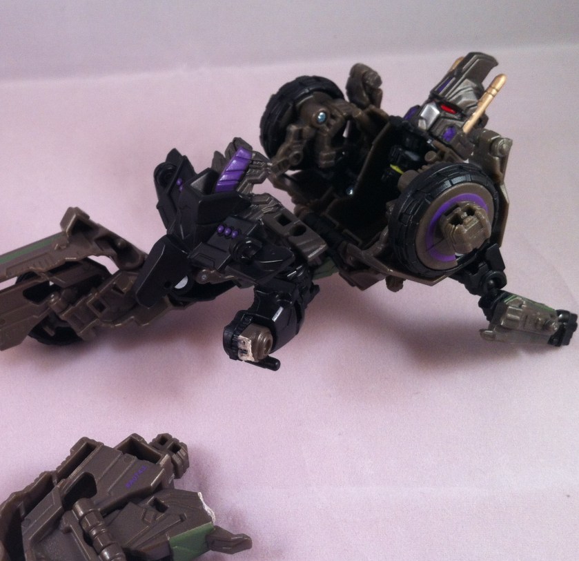
This was an issue I was worried about right out of the box, as the section was almost entirely snapped off when I opened him, but apparently the super glue was just not strong enough to hold during the connection process (I blame the extremely difficult connection pegs in this design). SO….after failing to fix it for a third time, I’ve decided to retire my SDCC Bruticus to his box, broken leg and all. You can’t see it as long as he’s in the plastic tray correctly, and the Takara version should be similar enough that I won’t need SDCC out of his box anyway. *sigh*…still stinks though.
Anyway, let’s take a quick look at the awesomely G2 themed Box Bruticus comes in:
I mean…its absolutely, 100% spot on with the G2 Style. Even down to the hand drawn rendering of Bruticus himself (including his G1 version gun!)

Same with the back. Everything looks exactly as it did back in 1994! The box alone makes this set worth while, though I really can’t keep him in the box, because I love having him on my shelf “properly” transformed. Well worth the cheaper than retail price if you pre-ordered, and even if you didn’t, he’s still less than ordering the retail colors online.
Finally, let’s take one last look at the whole team:
So NEON! Lol.
Up next, I’ll have a few smaller posts about the Kabaya guys I’ve picked up (one of which is Fortress Maximus) and then I’ll get the the BotCon 2010 set. FansProject Broadside is en route from the warehouse too so hopefully I’ll have him in a a week or so.
Stay Tuned!






Wow! That combination looks awesome! I really dig the G2 version. I wasn’t able to get the SDCC release and just wasn’t feeling the retail colors. The G2 brings back some nice memories and having him in hand I can say FOC Bruticus turned out better than expected.
Sorry about your Onslaught, dude, that sucks.
Yeah, he really looks better with some tweaks to the transformations. Takara’s version of them is based on SDCC colors, so that’s a great alternative. Yeah, I’m not thrilled that a 300$ collectible is now worth 20 bucks.